
Mobile Friendly Forms: Why Responsive Form Design Matters
Learn why mobile friendly forms improve user experience, increase submissions, and help turn website visitors into potential clients with SmartFormify.
Today, almost every business has a website, and most visitors use online forms to ask questions, request services, or give feedback.
Many websites forget one key thing: most visitors are on mobile phones, not computers.
If a form isn’t mobile friendly, fields can be too small, layouts may break, or it can be hard to read. Visitors often leave without submitting anything.
Mobile friendly forms adjust automatically to phones, tablets, and desktops. Tools like SmartFormify make it easy to create responsive forms without any coding.
What Is Responsive Form Design?
To understand mobile friendly forms better, it is helpful to know about responsive form design.
Responsive form design means the form adjusts automatically depending on the screen size of the device being used.
For example, on a desktop computer the form may appear wide with fields placed side by side.
On a mobile phone, the same form will adjust into a vertical layout so it fits the screen better.
Buttons become easier to tap, text remains readable, and fields stay properly aligned.
This helps users complete the form without zooming, scrolling sideways, or struggling with the layout.
Because of this flexibility, responsive forms provide a smoother experience across different devices.
Why Mobile Friendly Forms Are Important
Mobile internet usage is growing every year. Many people now browse websites and contact businesses directly from their phones.
Imagine a visitor opens your website on their phone and wants to send an inquiry. If the form is hard to use, they may simply leave and try another website.
A mobile friendly form helps avoid this problem.
When forms work well on mobile devices, businesses can:
- Make it easier for visitors to contact them
- Increase form submissions
- Reduce user frustration
- Collect better information from customers
- Improve the overall website experience
A simple and clear form makes visitors feel comfortable sharing their details.
Problems With Forms That Are Not Mobile Friendly
When forms are designed only for desktop screens, they often create problems for mobile users.
The input fields may appear too small, which makes typing difficult. Sometimes buttons are also too tiny to tap easily.
Another common issue is when forms require too much scrolling or zooming.
These small frustrations may seem minor, but they often cause visitors to leave the form before finishing it.
When this happens, businesses lose potential leads and inquiries.
Responsive forms help avoid these problems by adjusting the layout automatically so users can complete the form comfortably.
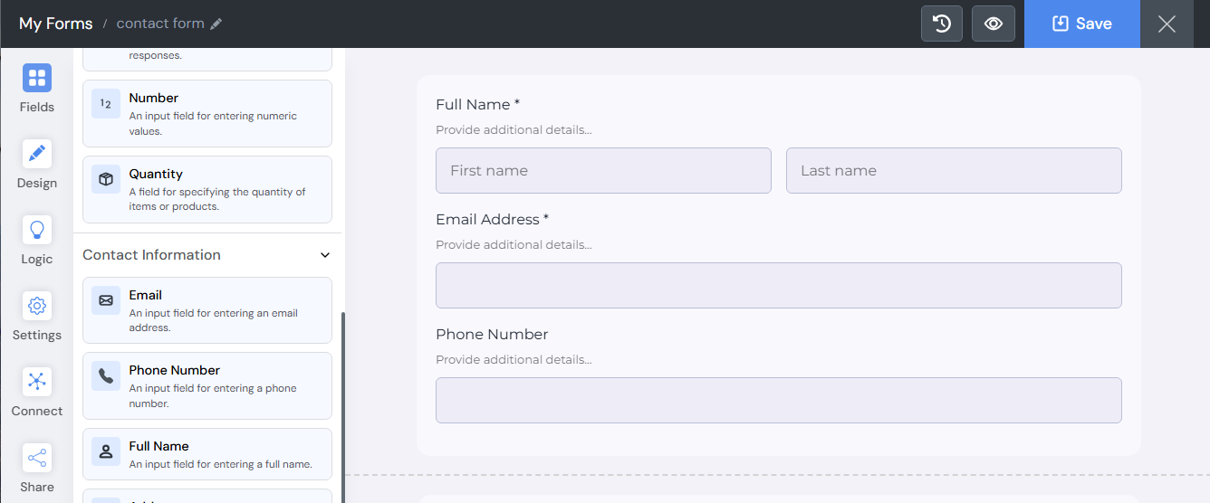
Creating Mobile Friendly Forms with SmartFormify
In the past, creating responsive forms required technical skills. Developers had to write code and test the form on different devices.
Today, modern tools have made this process much easier.
Platforms like SmartFormify allow anyone to create professional forms without needing programming knowledge.
You can simply drag and drop form fields, arrange them in the layout, and customize the design according to your needs.
The platform automatically ensures that the form works smoothly on mobile devices as well as desktops.
This saves time and removes the need for technical expertise.
Why SmartFormify Matters
SmartFormify is a modern no code form builder designed for businesses that want to create effective forms quickly.
With SmartFormify, you can easily:
- Build forms without any coding skills
- Create inquiry forms that turn visitors into leads
- Use step by step smart logic to guide users through your form
- Share forms instantly via a link
- Embed forms anywhere on your website
- Create clear and organized forms that collect better quality responses
A well designed form not only makes it easier for visitors to fill it out but also helps businesses collect the information that matters most.
Final Thoughts
Mobile devices have changed the way people interact with websites. Many visitors now browse and contact businesses directly from their phones.
If your forms are not mobile friendly, you may lose valuable inquiries and potential clients.
Responsive form design ensures that forms remain clear, easy to use, and accessible on every device.
With SmartFormify, businesses can create modern forms without coding, share them easily, and embed them on their websites. The platform makes it simple to design forms that work smoothly on phones, tablets, and computers.
When your forms are clear and easy to complete, visitors feel more confident reaching out. Over time, these small interactions can turn website visitors into loyal customers.

Share this post


Latest posts
8 min read
How to Collect Leads From ChatGPT, Lovable, Bolt and Other AI Websites
7 min read
How to Connect AI Built Websites to a Form Backend
8 min read
How Agencies Can Manage Client Website Forms More Efficiently
8 min read
Best Contact Form Solution for Small Businesses
5 min read
How to Centralize Leads From Multiple Websites